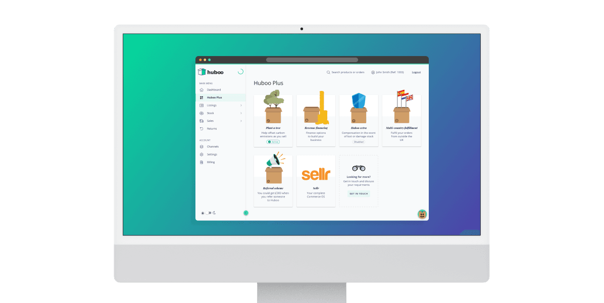
Huboo Plus
UI design for client-facing fulfilment dashboards
The Challenge
Huboo Plus was designed to give clients visibility and control over fulfilment add-ons, but over time the dashboard had become cluttered and visually inconsistent.
Key actions were buried within dense layouts, status indicators lacked clear hierarchy, and important information was not easily scannable. As a result, clients struggled to quickly understand what required attention, leading to frustration and an increase in support queries.
The goal of the redesign was to create a clearer, more structured dashboard that supported quick decision making while elevating the overall polish of the product.
The Approach
I began by auditing the existing dashboard screens to identify inconsistencies in layout, spacing, and component behaviour. I also worked with product managers, developers, and client facing teams to understand where users were encountering friction and which tasks were most critical.
From this, I focused on three priorities:
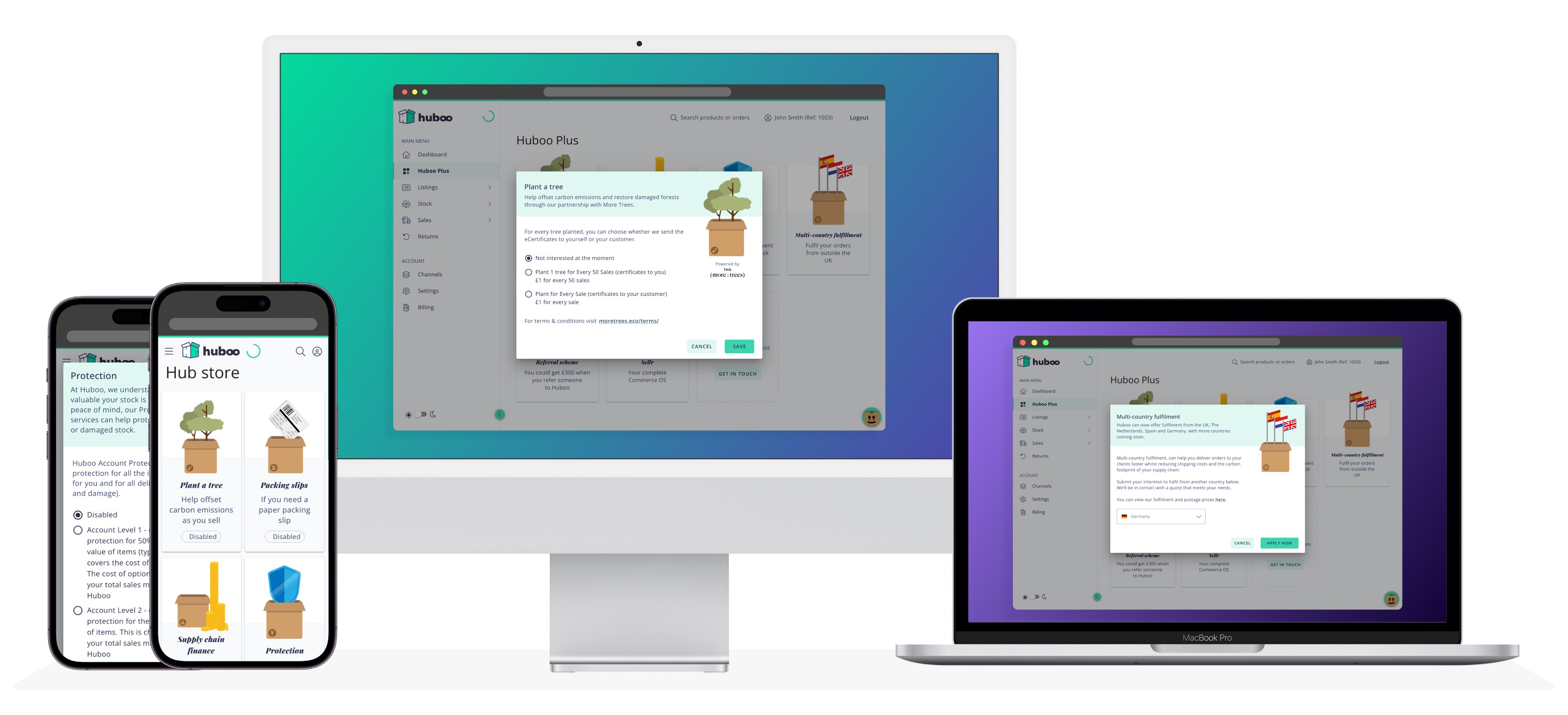
Strengthening visual hierarchy to surface high priority information
Simplifying navigation to reduce cognitive load
Standardising UI components to improve consistency across the platform
Core UI elements were redesigned with clearer states and more deliberate spacing to improve scannability. Status indicators were refined to make progress and attention points immediately visible.
Alongside the interface redesign, I developed a shared component library and supporting style documentation. This ensured consistency beyond the dashboard itself and created a scalable foundation for future features.


The Outcome
The redesigned Huboo Plus dashboard delivered a more intuitive and structured client experience.
Clients were able to navigate more confidently, identify key actions more quickly, and track add-on statuses at a glance. Internal teams reported a noticeable reduction in support queries related to dashboard confusion.
From a product perspective, the introduction of reusable components and documented UI standards improved development efficiency and reduced inconsistency across subsequent updates.

What I Learned
This project reinforced the importance of designing dashboards for clarity under complexity. When users rely on a product to manage live operational processes, hierarchy and scannability directly impact confidence and efficiency.
It also strengthened my ability to balance immediate interface improvements with longer term system thinking, ensuring that visual consistency supported both users and internal teams as the product evolved.